- Faris Delija
- January 2021
- Uncategorized
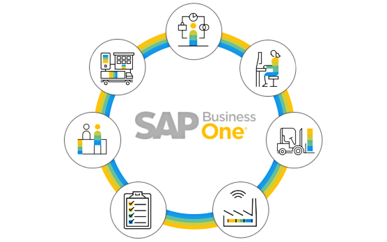
In this post, we provide an overview of SAP HANA Analytics, talk about how to use the Pervasive Analytics designer, what to do with SAP B1 interactive analysis, and how to leverage excel reports. With SAP Business One, you no longer need to review dozens of separate reports. Instead, the system provides the ability to leverage a cockpit with dashboards characterizing your enterprise. For instance, you can view the value of the sales pipeline, the top 10 leads by the size of the deal, summary information from reports from multiple modules, key performance indicators on the health of the company, etc.
SAP HANA Analytics Essentials
SAP HANA is a database that underlies SAP Business One. It is structured in a way built for analytics with rapid reporting. SAP HANA utilizes two data schemas: traditional row-oriented data storage and column-oriented data schema (better transaction summarizing). The combination of approaches leads to the highest possible efficiency in the corresponding business processes.
SAP Business One utilizes semantic layers to provide a common definition of business objects. This enhancement is used in reporting and analytics. Furthermore, the increased performance of the SAP HANA database is a matter of all SAP Business One reporting tools:
- Microsoft Excel Pivot tables;
- Pervasive Analytics dashboards and KPIs;
- Excel Reports;
- SAP Lumira;
- Crystal Reports.
Various semantic layers contain business models used in analytics, sitting on top of the data itself. Note that the layers provide views that you can use to manipulate the data when you create interactive reports or dashboards and KPIs. Although there is a fixed number of views in SAP Business One by default, you can create additional views if applicable.
However, the default views may be enough. Another good news is that it’s not necessary to understand how to build or manage the views to use them in reporting. You only need to choose the right view to create a dashboard, KPI, or report.
When it comes to the types of views, SAP Business One offers the following two categories:
- Analytic views – data from transactions such as A/R invoices or cost center postings;
- Calculation views – data from multiple transactional tables or business areas.
SAP Business One Pervasive Analytics Designer
SAP Business One offers a powerful but at the same time easy-to-use analytic tool – the Pervasive Analytics Designer. The solution provides the ability to create and edit key performance indicators (KPIs) and two dashboard types: pervasive and advanced. All the information available in the corresponding windows appears in your cockpits.
You can start using the Pervasive Analytics Designer as follows:
- Click on the Pervasive Analytics Designer icon on the toolbar;
- Use the buttons to create new KPIs or dashboards on the left;
- Use three columns to the right of the buttons to view the existing KPIs, pervasive dashboards, and advanced dashboards.
Note that SAP Business One lets you open any of the existing objects to view their definition or apply changes. Just click on the object’s name to initiate editing. Also, it is possible to eliminate any object from the list.
How to create a pervasive dashboard
Below, you will discover how to create a pervasive dashboard in SAP Business One. Let’s assume that it is necessary to create a dashboard that displays the potential value and the business partner associated with the top sales opportunities in the pipeline. Open the Pervasive Analytics Designer, choose the option to create a dashboard, and follow the steps described below:
Select a data source
The very first interaction with the dashboard is to choose its data source. You can do that in the dashboard by clicking on the icon. SAP Business One provides the ability to set user-defined queries, calculation view, or analytic view as your data source.
After clicking on a data source in the list, SAP Business One displays its definition along with its results.
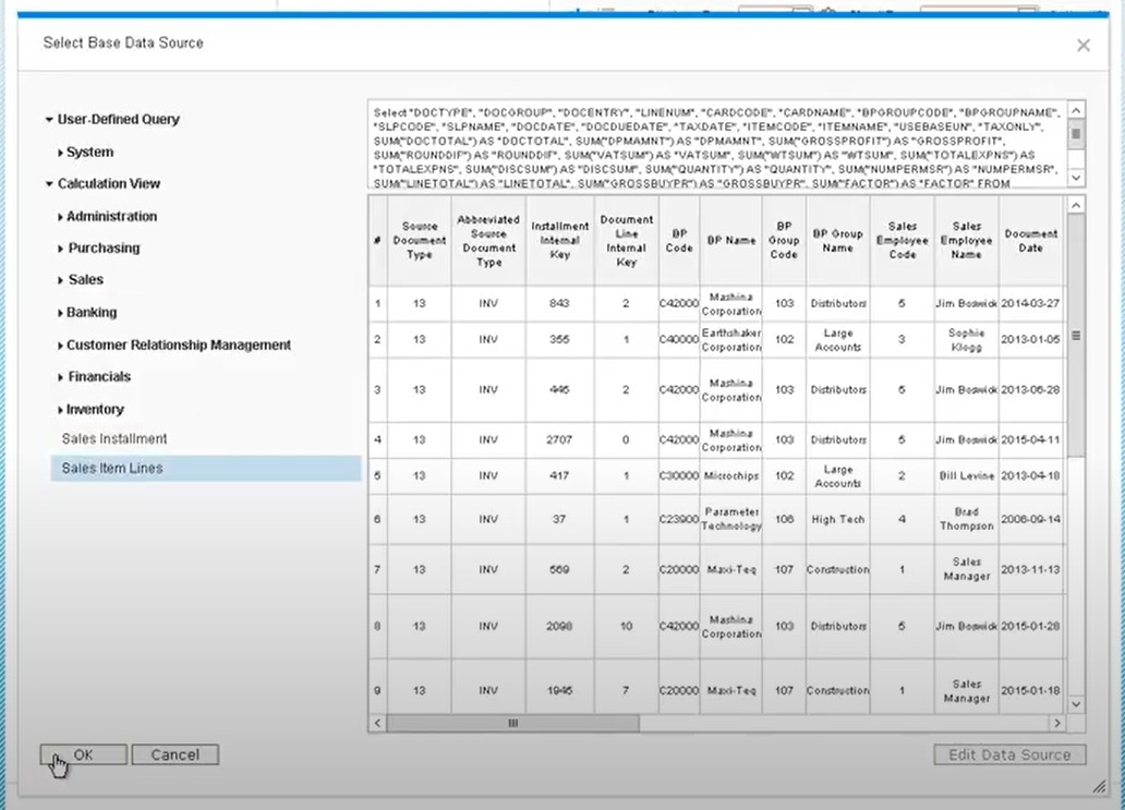
Let’s choose the analytic view for sales opportunities. The top part of the screen shows the select statement. The table below displays the results.
Dashboard basic settings
Now, when the data source is selected, you have to define the basic settings.
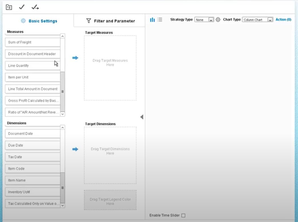
Choose the measures (numbers such as quantities, amounts, and prices) and dimensions (data elements with attributes, such as a business partner). After that, SAP Business One will generate a chart in the window to the right of the Basic Settings tab. Now, you can change the chart type.
Dashboard actions
What makes pervasive dashboards so great is the ability to add actions. For instance, it is possible to automate the launch of an Enterprise Search via a dashboard. Open a master data window, document window, or advanced dashboard with additional analytics. For a chart displaying customers with opportunities, SAP Business One provides the ability to launch an Enterprise Search or proceed to the business partner master from the chart.
Now, you can set up actions for a pervasive dashboard. Choose a link to add actions from within the dashboard definition. You can choose from four types of actions:
- Open SAP Business One window – displays a master data or document window from the dashboard.
- Trigger Enterprise Search – initiates the Enterprise Search for a master data value passed into the search.
- Open an advanced dashboard – opens a dashboard that acts as a supplementary cockpit.
- Link to SAP Business One window – embeds the dashboard as a permanent link to a master data or transaction window. Thus, displaying an existing master data or document window is enhanced with the corresponding chart shown on the right.
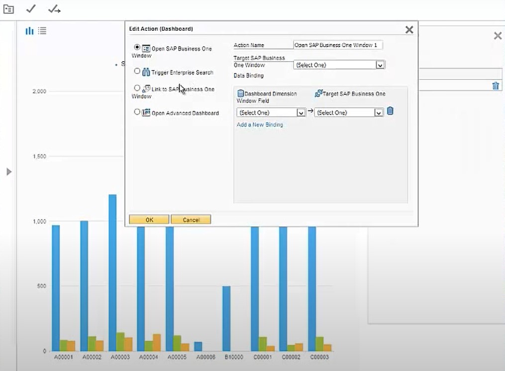
Below, we explain how to set up an action for a pervasive dashboard to launch an Enterprise Search:
- After defining the dashboard settings, use the link in the same window for creating or editing actions. The link displays the number of actions that are associated with the dashboard. However, clicking on the link provides you with a list of any existing actions. Also, you will find a button for creating new actions.
- Click the Add Action button to launch the Edit Action (Dashboard) window.
- Select the action type you wish to add to your dashboard.
- Provide a name for your action (displayed in the cockpit).
- Set up data binding to pass values from the dashboard into the action that you want to launch.
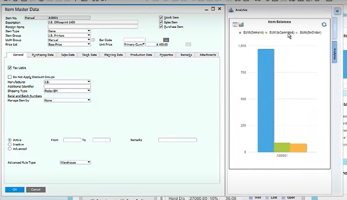
Note that the data binding area varies a lot depending on the action type you choose. Setting up an action to launch an SAP Business One window requires the field with the values you wish to pass from the chart along with a field you are passing the values to. However, fields and values vary significantly.
Another important aspect is related to authorizations. If a user wants to view the content inside a dashboard but doesn’t have a corresponding authorization, nothing is displayed.
How to create advanced dashboards
As we’ve just mentioned, SAP Business One offers two dashboard types: pervasive and advanced. Let’s say a few words about the second type.
An advanced dashboard is a supplementary cockpit that contains several pervasive dashboards and KPIs. Consequently, you can launch an advanced dashboard from a pervasive dashboard or a KPI widget to gain quick access to extended business analytics in multiple related charts and KPIs, gaining additional insights.
Despite the possible complexity of advanced dashboards, creating them is extremely easy:
- Go to the Pervasive Analytics Designer;
- Choose the option to create an advanced dashboard;
- Name your new advanced dashboard;
- Add pervasive dashboards and KPI widgets.
- Add more than one page if necessary (each page needs a name);
- Add filters if necessary to narrow down the selection of pervasive dashboards inside the advanced dashboard;
- Save your advanced dashboard;
- Set up an action in a pervasive dashboard or KPI to launch your new advanced dashboard.
You can find more information on how to create and manage pervasive and advanced dashboards in SAP Business One in this video:
How to create a key performance indicator (KPI)
You get a set of predefined KPI cockpit widgets in SAP Business One that reflect various critical success factors in a company. For instance, they illustrate such vital aspects as revenue targets and profit margins.
Using KPIs is associated with the two benefits. Firstly, you can always check progress towards achieving your company’s strategic goals with the help of the default means. Secondly, you can create any custom KPI to follow the unique requirements of your business.
Usually, KPIs consist of the following elements:
- Name;
- Value (colors are used to indicate performance);
- Date range;
- Trend (colors are used to indicate performance).
This information is enough to check progress towards achieving your company’s strategic goals. As for the second benefit, we describe it below. Let’s assume that you need to create a custom KPI for measuring overdue deliveries:
- The KPI target is to reduce overdue deliveries to 1 or 0 per month;
- It should also alert us if the target with a range of 2-5 per month is approached;
- The measurement should be processed monthly
To create this custom KPI in SAP Business One, follow these steps:
- Determining what you wish to measure;
- Specify a query or view as a data source;
- Provide a name and description to your KPI;
- Choose the base measure for your KPI.
- Select the base dimension for your KPI.
- Specify how to inform you about the target (whether it is met or not) and trending in the correct direction.
- Set a color scheme to reflect progress.
- Configure other additional options.
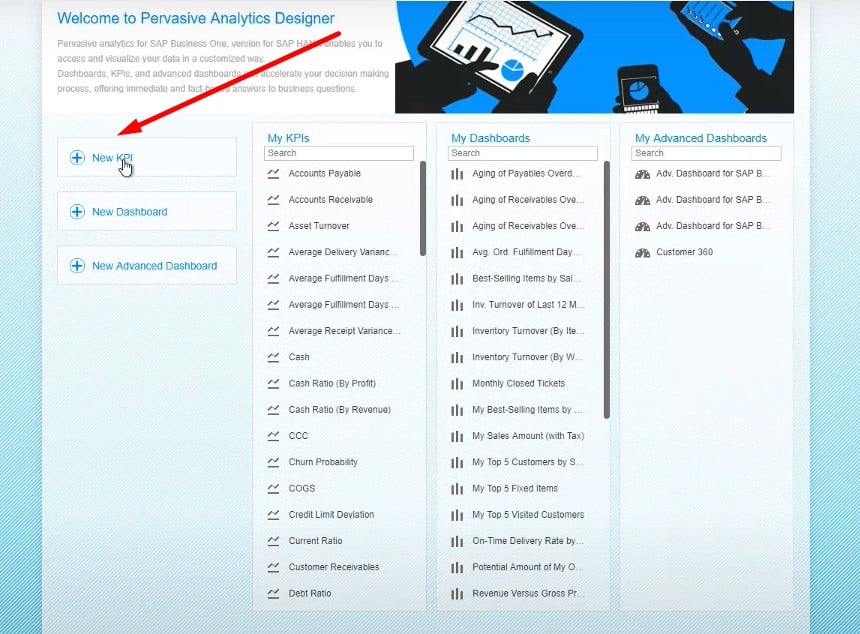
How to creatу and name KPI
You can create and name your custom KPIs in SAP Business One as follows:
- Open the Pervasive Analytics Designer;
- Choose the option to create a KPI;
- Specify a name for the KPI on the Settings tab;
- Provide a description.
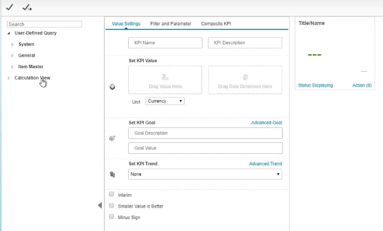
How to select a base measure for KPI
Inside the KPI Definition, you can view all the existing user-defined queries, analytic views, and calculation views. You can also select them as the basis of your KPI:
- Open the query or view;
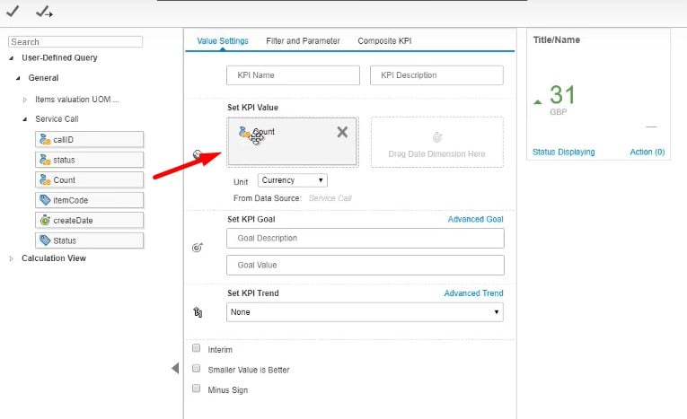
- Drag-and-drop a measure from the data source definition to the first box in the Set KPI Value area;
- Use the dropdown box to select the appropriate unit.
To follow the example provided above, we need a query that compares actual delivery dates to the expected delivery dates. It will be our data source. Choose the Count measure to achieve a count of deliveries where the actual date was later than the expected one. Note that it is not necessary to use units for such KPIs. However, if it is necessary to count the number of days late, specify Day as the unit.
How to select a base dimension for KPI
You can choose a dimension for your KPI from the same query:
- Open the query or view;
- Drag-and-drop a dimension from the data source definition to the first box in the Set KPI Value area;
- Use the dropdown box to select the dimension granularity.
Since our goal is to measure whether we have met all expected delivery dates within a month, it is necessary to choose the Expected Delivery Date dimension and choose Month from the dropdown.
How to specify goals and trends for KPI
After the base measure and dimension for your KPI are configured, you can configure goals and trends. Depending on the nature of your KPI, trends are considered to be improving as the number rises or falls. You specify the period you compare the current results to – this month to last month or this month compared to the same month in the prior year.
You can configure these and other settings for KPIs under the Value Settings tab:
- KPI Goal Description – help viewers to understand the goal;
- Target – a numerical value for the selected unit of the measure;
- Trend – compare to the prior period or to the same period in the prior year (Month-on-Month vs Month over Month);
- Smaller is Better – this checkbox indicates whether the goal is a smaller number rather than a larger one.
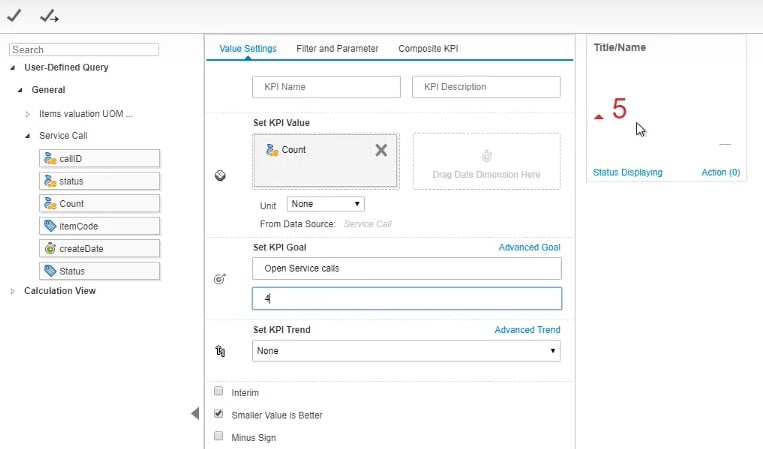
It is possible to customize your KPI even more with the help of the Advanced Goal and Advanced Trend areas. Building KPIs on top of other KPIs is possible. Use the Interim checkbox to show or hide the corresponding feature.
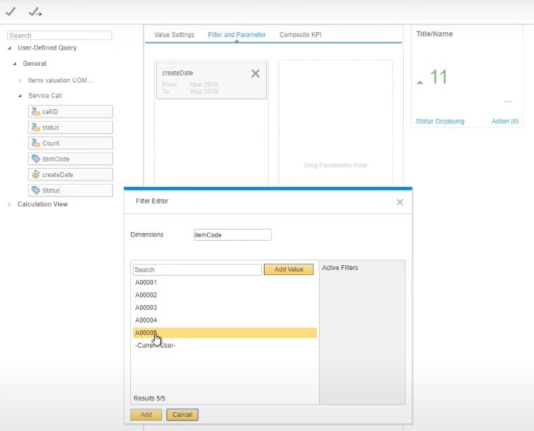
You can also configure filters for your KPIs (watch the video below).
How to set colors for KPI to reflect progress
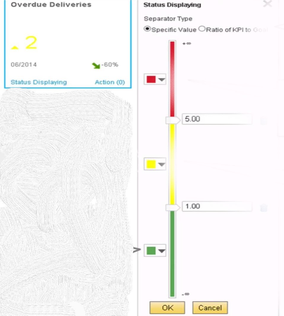
SAP Business One lets you choose which colors to use for the display. Also, you can a color per range. Follow these steps to set colors for KPI to reflect progress in SAP B1:
- Hit the Status Displaying link;
- SAP redirects you to the system where you can configure colors;
- Set color ranges based on values or ratio;
- Set ranges and apply colors to them.
Note that these are just the basics of how to create and manage KPIs in SAP Business One.
SAP Business One Interactive Analysis
As we’ve mentioned at the beginning of this article, the SAP Business One version for SAP HANA offers additional benefits when it comes to reports. The Excel-based Interactive Analysis is at your disposal. This tool takes data directly from the SAP HANA database in real-time and uses predefined semantic layers to create a set of reports that combine different types of data.
Another important aspect of Interactive Analysis is that this system is fully integrated with Microsoft Excel. Thus, you work in a familiar interface, leveraging existing skills to create custom reports. Since the tool leverages a pivot table of MS Excel, you can specify which fields to include, how to filter the report, and what visual representation it gets.
If you are familiar with pivot tables, you just need to proceed to the main menu of SAP Business One and choose Interactive Analysis. After that, select the area you wish to examine. The system will visualize the data.
Excel Reports
Along with Interactive Analysis, you also get Excel Reports in SAP Business One. However, the version for SAP HANA is required. The tool analyzes live data from the SAP HANA database, using predefined semantic layers. Since the Excel Reports functionality is fully integrated with Microsoft Excel, even users without technical skills can leverage it to create customized reports. As for the pre-delivered Excel Reports, they are available in SAP Business One under Tools → Excel Reports and Interactive Analysis Designer. You can also create new ones here. More information about SAP Business One Excel Reports is available below:
